Introduction
The vintage 1970s represented an iconic era in color design, characterized by distinctive palettes that ranged from earthy browns and vibrant oranges to the unmistakable avocado green. These vintage 1970s color palettes reflected the decade’s cultural shifts toward nature-inspired design, self-expression, and reaction to the mod aesthetics of the 1960s. Whether you’re renovating a period home, creating retro-inspired interiors, or simply admiring vintage design, understanding authentic 70s color schemes provides valuable inspiration for modern applications.
Random 70s Color Palette Generator
This comprehensive guide explores the defining color palettes of the 1970s, including specific color codes, historical context, and practical advice for incorporating these timeless retro colors into contemporary spaces. From the warm earth tones that dominated living rooms to the bold accent colors that defined 70s kitchens and bathrooms, you’ll discover why these vintage color combinations continue to influence design today.
The Defining Color Palettes of the 1970s
Earth Tone Color Palette: The Foundation of 70s Design
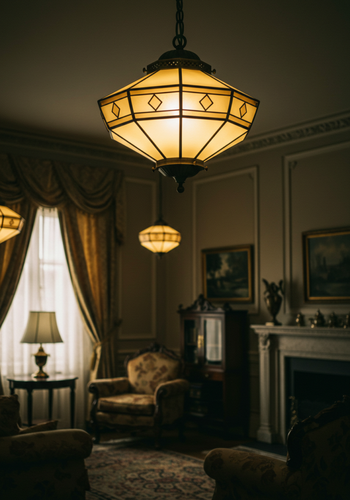
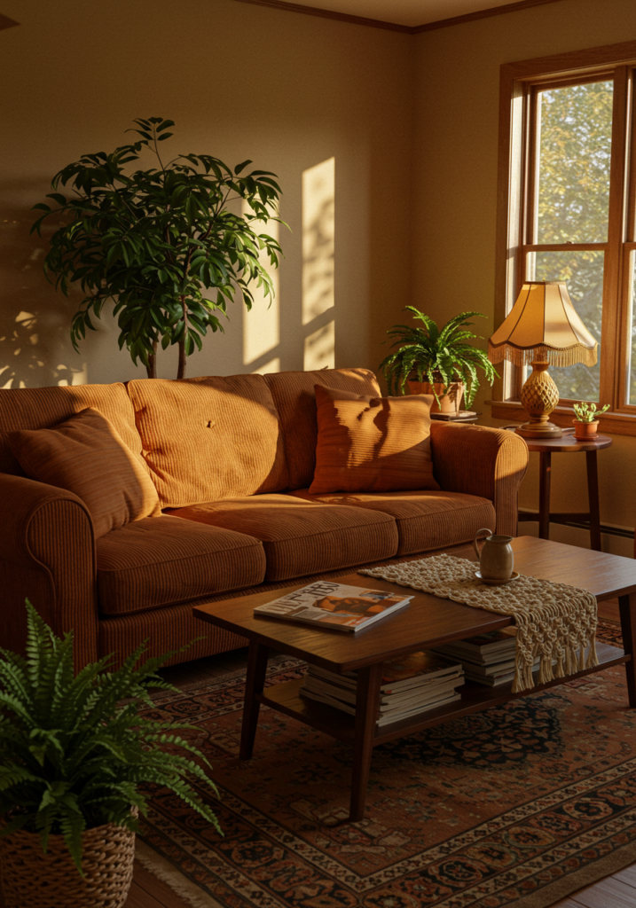
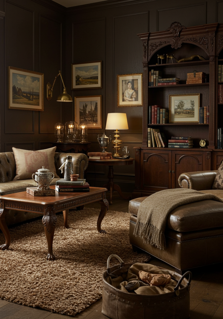
Earth tones formed the cornerstone of vintage 1970s interior design, creating warm, grounded spaces that reflected the era’s back-to-nature movement. This quintessential 70s color palette featured rich browns, tans, and beiges complemented by terracotta, ochre, and warm neutrals.
Key Earth Tone Colors in the 1970s:
- Chocolate Brown (
#5A3A22) – The decade’s signature color, used for everything from wood paneling to furniture - Harvest Gold (
#E6BE8A) – A warm yellow-gold that appeared in appliances and fixtures - Terracotta (
#A95C37) – A reddish-brown earth tone used for accent walls and textiles - Caramel (
#C68E3F) – A warm medium brown popular for furniture and carpeting - Sand Beige (
#D4C5B1) – A neutral foundation color often used for walls and larger furniture pieces
Earth tones were frequently layered together, creating richly textured interiors where different shades of brown could coexist harmoniously. These colors were perfectly complemented by the natural materials prevalent in 70s design: wood paneling, cork surfaces, rattan furniture, and shag carpeting all enhanced the organic feel of earth tone color schemes.
Earth Tone Color Palette: Sample Combinations
- Chocolate Brown + Harvest Gold + Cream
- Terracotta + Sand Beige + Olive Green
- Caramel + Burnt Sienna + Golden Yellow
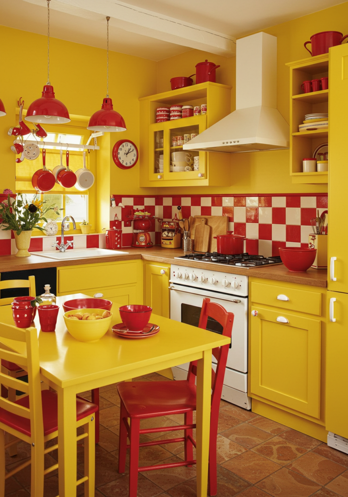
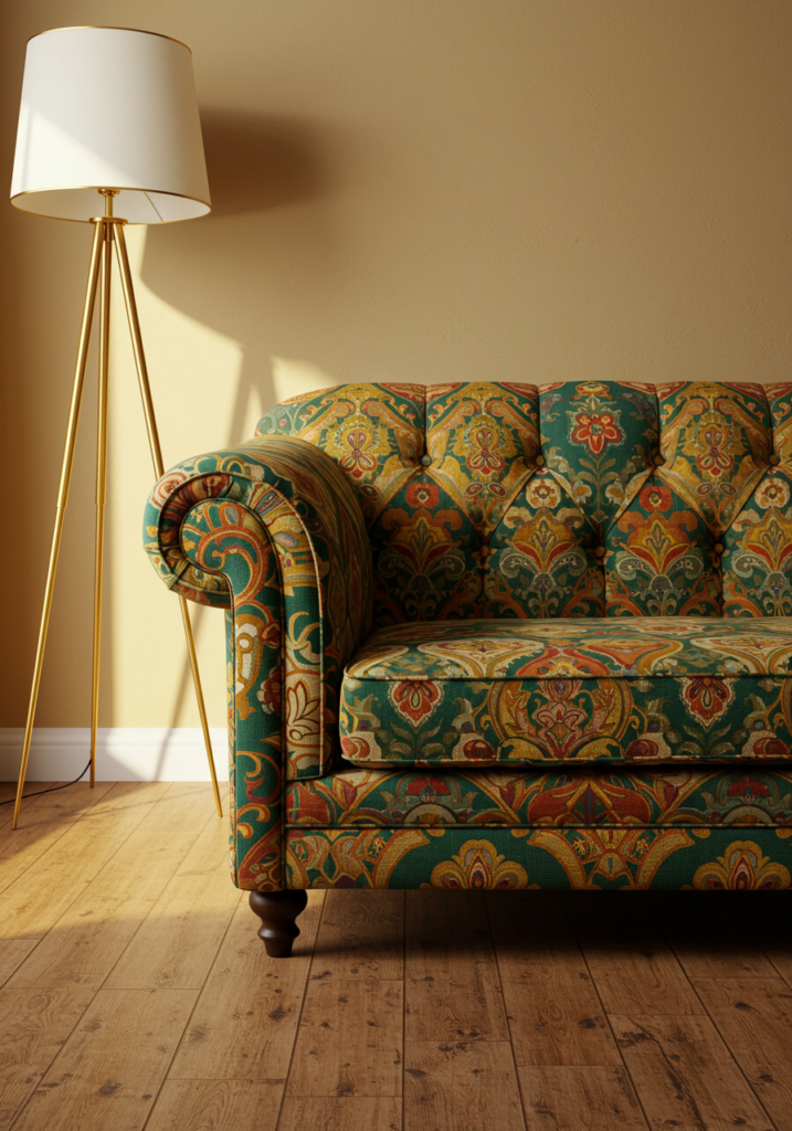
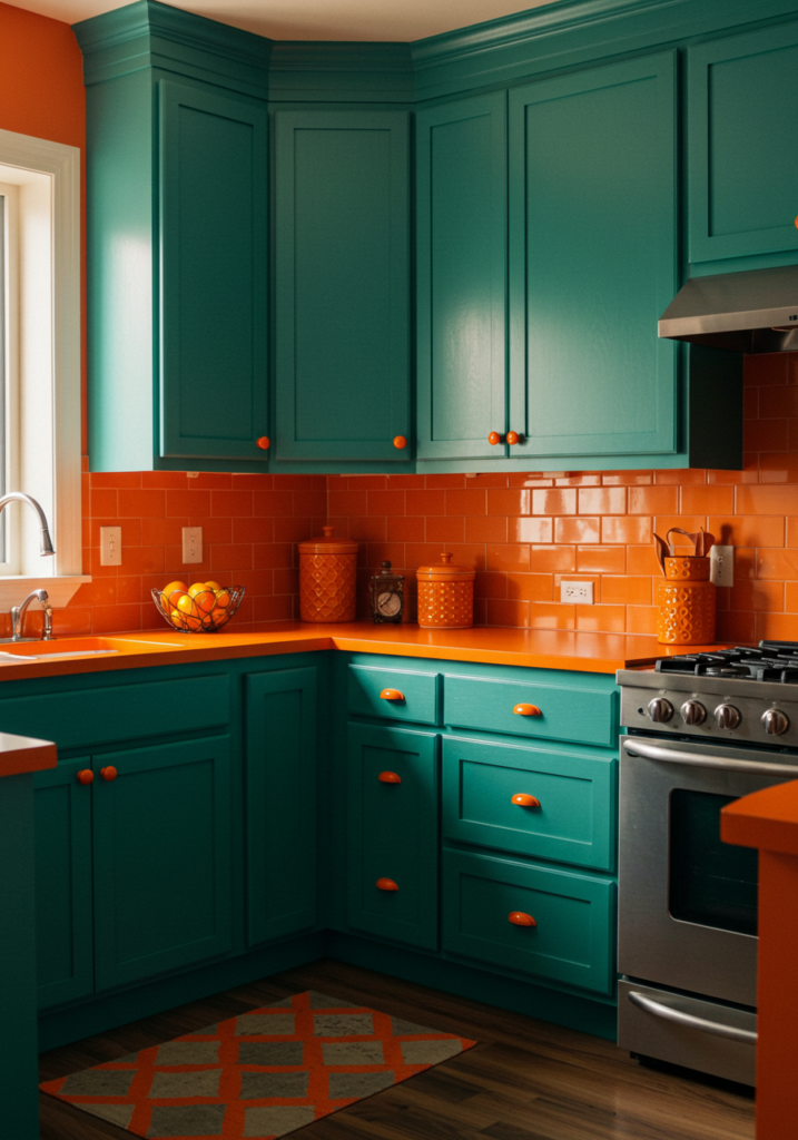
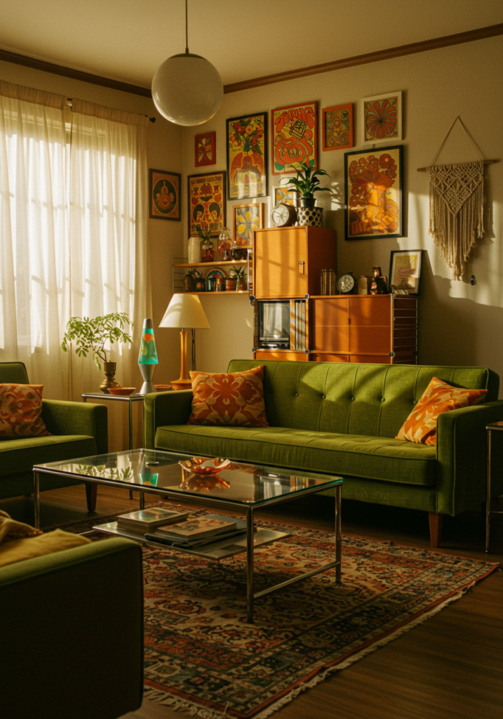
Avocado Green & Mustard Yellow: The Iconic 70s Duo
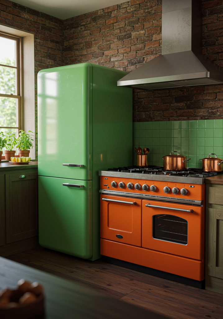
No colors symbolize vintage 1970s interior design more distinctly than avocado green and mustard yellow. These statement hues appeared everywhere from kitchen appliances and bathroom fixtures to furniture and textiles.
Avocado Green (#568203) – This distinctive yellow-green shade named after the fruit dominated kitchens and bathrooms. Slightly muted rather than bright, avocado green appliances became so ubiquitous that they defined an entire era of kitchen design.
Mustard Yellow (#E3A857) – A rich, warm yellow with earthy undertones, mustard yellow brought vibrant energy to 70s spaces. Often used for accent furniture, throw pillows, and decorative elements, this color added warmth while complementing the prevalent earth tones.
These colors weren’t merely aesthetic choices but reflected the cultural focus on natural living and environmental awareness emerging in the 1970s. They were frequently paired together or combined with brown for a quintessential 70s color scheme.
Avocado & Mustard Color Combinations:
- Avocado Green + Mustard Yellow + Dark Brown
- Avocado Green + Cream + Burnt Orange
- Mustard Yellow + Chocolate Brown + Olive Green
Burnt Orange & Harvest Gold: The Warm Vibrant Palette
Warm, vibrant hues like burnt orange and harvest gold brought energy and optimism to 1970s interiors, balancing the earthier brown tones that dominated the decade.
Burnt Orange (#BF5700) – This deep, reddish-orange color became synonymous with 70s design, appearing on everything from accent walls and furniture to small appliances and decorative objects. Its warmth and vibrancy made it perfect for statement pieces in earth tone-dominated rooms.
Harvest Gold (#E6BE8A) – A warm, muted yellow-gold that bridged the gap between neutrals and statement colors. Harvest gold was especially popular for kitchen appliances, bathroom fixtures, and textiles.
Together, these colors created the warm, cozy atmosphere that defined 70s interiors. They worked particularly well in living rooms and dining areas, creating inviting spaces for entertaining.
Burnt Orange & Gold Color Combinations:
Harvest Gold + Burnt Sienna + Olive Green
Burnt Orange + Harvest Gold + Chocolate Brown
Burnt Orange + Cream + Walnut Brown
Olive Green & Teal Blue: The Secondary 70s Palette
Beyond the most iconic 70s colors, olive green and various blue-greens played important supporting roles in 1970s color schemes, adding depth and variation to interiors.
Olive Green (#556B2F) – A muted, grayish green that offered a versatile alternative to brighter avocado. Olive green worked well for larger furniture pieces, curtains, and accent walls.
Teal Blue (#00747C) – This blue-green shade added a cooler counterpoint to the predominantly warm 70s palette. Used more sparingly than the earth tones, teal appeared in bathrooms, furniture pieces, and decorative elements.
These colors provided balance in 70s interiors, preventing the warm earth tones from becoming overwhelming. They were often used in bedrooms and bathrooms where cooler, more calming colors were preferred.
Green & Blue-Green Color Combinations:
Olive Green + Burnt Orange + Sand Beige
Olive Green + Chocolate Brown + Cream
Teal Blue + Mustard Yellow + Walnut Brown
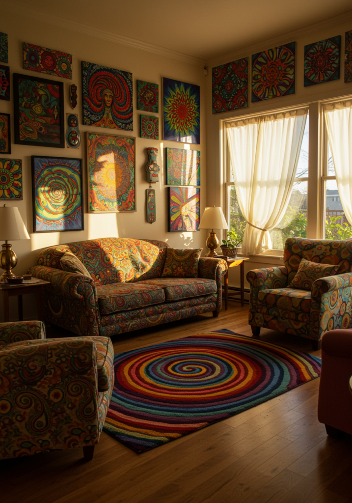
Bold Accent Colors: Pops of Vibrancy
While earth tones dominated, the 70s weren’t shy about incorporating bold accent colors that added energy and personality to spaces.
Hot Pink (#FF69B4) – Used for small decorative elements and textiles
Electric Blue (#0072BB) – Appeared in artwork, cushions, and occasional furniture
Violet Purple (#7F00FF) – Found in psychedelic-inspired designs and artistic spaces
These bolder colors were typically used in limited quantities, appearing as accent pillows, art pieces, small furniture items, or decorative objects. They provided visual interest and personality against the more subdued earth tone backgrounds.
The strategic use of these accent colors demonstrates how 70s design balanced warmth and coziness with playfulness and self-expression.
The Cultural Context of 1970s Color Palettes
The distinctive color palettes of the 1970s weren’t arbitrary fashion choices but reflected deeper cultural currents and social movements of the time.
Back-to-Nature Movement
The prominence of earth tones directly connected to the environmental awakening of the early 1970s. The first Earth Day was celebrated in 1970, and growing ecological consciousness influenced design preferences toward natural colors and materials.
Post-60s Reaction
The earthy 70s palette also represented a deliberate shift away from the bright, synthetic colors of the 1960s mod era. After the optimism and psychedelia of the previous decade, colors became more grounded and contemplative.
Economic Context
The energy crisis and economic challenges of the mid-1970s contributed to the popularity of warm colors that created cozy, nurturing environments during uncertain times. These colors helped create emotional comfort in the home.
Handcraft Revival
The resurgence of interest in handicrafts like macramé, weaving, and pottery naturally aligned with the earthy color schemes, as these crafts often used natural, undyed materials or earth-inspired pigments.
Understanding these cultural factors helps explain why 70s colors weren’t just a passing trend but reflected deeper societal values and concerns—part of why these palettes continue to resonate today.
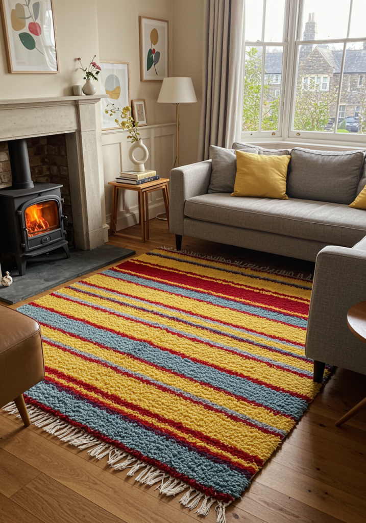
How to Use 1970s Color Palettes in Modern Interiors
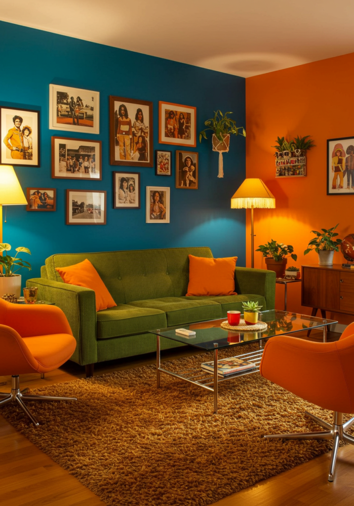
The Modern 70s-Inspired Living Room
Contemporary interiors can successfully incorporate 1970s retro color palette without creating dated-looking spaces. The key is selective use and thoughtful balance with modern elements.
Creating Balance with 70s Earth Tones:
- Use chocolate brown and caramel as anchoring neutrals for furniture pieces
- Incorporate warm wood tones that complement the 70s palette
- Add textural elements like bouclé or woven materials in earth tones
- Balance with contemporary whites or grays to prevent heaviness
70s Accent Colors in Modern Spaces:
- Use burnt orange or mustard yellow for statement furniture pieces like accent chairs
- Incorporate avocado green in smaller doses through cushions, throws, or decorative objects
- Consider an accent wall in a 70s-inspired color paired with modern furniture
Contemporary Applications Example: A modern living room might feature a caramel leather sofa, white walls, and natural wood furniture, with mustard yellow throw pillows and a burnt orange area rug adding 70s color energy while maintaining contemporary appeal.
70s-Inspired Color Schemes for Different Rooms
Kitchen:
- Consider two-tone cabinetry using cream with avocado green or walnut brown
- Add small appliances or kitchen textiles in harvest gold or burnt orange
- Use warm metals like brass or copper for hardware and fixtures
Bedroom:
- Create a calming space with olive green walls paired with white trim
- Add warmth with caramel or terracotta bedding
- Incorporate rattan or wood furniture elements that complement earth tones
Bathroom:
- Use teal blue or avocado green as accent colors rather than full commitment
- Consider terracotta or burnt orange towels against neutral backgrounds
- Add warm metallic fixtures that echo the harvest gold of the era
Home Office:
- Create a focused environment with chocolate brown and mustard yellow accents
- Use earth tone textiles for window treatments and floor coverings
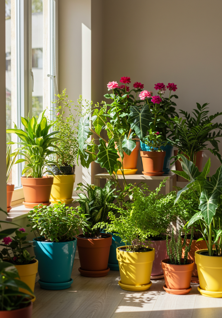
- Incorporate plants that enhance the natural color scheme
The 70/30 Approach to 70s Colors
For those hesitant to fully embrace 1970s colors, the 70/30 approach offers a balanced solution: use approximately 70% contemporary neutrals and 30% retro color accents.
How to Apply the 70/30 Approach:
- Start with a neutral foundation of whites, creams, or light grays
- Add medium-sized elements (furniture pieces, rugs) in muted 70s tones
- Include small accents and accessories in bolder 70s colors
- Maintain clean, contemporary lines in furniture to balance vintage colors
This approach allows you to capture the warmth and character of 70s color palettes without overwhelming your space or creating a purely retro environment.
1970s Color Palette Mood Boards
Earthy Sophistication Mood Board
Color Palette:
Cream (#F5F5DC)
Chocolate Brown (#5A3A22)
Caramel (#C68E3F)
Terracotta (#A95C37)
Key Elements:
- Low-profile modular sectional in chocolate brown
- Warm wood paneling or furniture with visible grain
- Textural elements like macramé wall hangings
- Ceramic pieces in terracotta tones
- Rattan or wicker accent furniture
- Layered rugs with organic patterns
This palette creates a sophisticated, grounded space that feels both vintage and timeless.
Bold 70s Statement Mood Board
Color Palette:
- Avocado Green (
#568203) - Burnt Orange (
#BF5700) - Mustard Yellow (
#E3A857) - Warm White (
#F5F2E9)
Key Elements:
- Statement chair in burnt orange bouclé fabric
- Geometric patterned cushions combining all three colors
- Brass or gold metallic accents
- Bold artwork incorporating the color scheme
- Textural wall treatments (textured paint or grasscloth wallpaper)
- Plants to enhance the natural color story
This bolder approach embraces the most distinctive colors of the 70s for spaces with character and visual impact.
Subtle 70s Influence Mood Board
Color Palette:
- Sand Beige (
#D4C5B1) - Olive Green (
#556B2F) - Muted Mustard (
#D4B74E) - Cream (
#F5F5DC)
Key Elements:
- Predominantly neutral space with strategic color accents
- Textural fabrics like bouclé and velvet
- Contemporary furniture with 70s-inspired colors
- Natural fiber rugs and textiles
- Warm wood tones in furniture and accessories
- Subtle patterns that reference 70s geometric designs
This approach offers a sophisticated nod to 70s style without fully committing to a retro aesthetic.
DIY Projects Using 1970s Color Palettes
70s-Inspired Painted Furniture
Transform basic furniture pieces with popular colours in the 70s for instant retro character:
Avocado Console Table:
- Select a simple wood console table with clean lines
- Sand and prime the surface
- Apply avocado green paint (consider chalk paint for an authentic matte finish)
- Add brass hardware for authentic 70s style
- Consider two-tone effects with natural wood elements
Mustard Yellow Bookshelf:
- Choose a basic bookcase with minimal detailing
- Apply mustard yellow paint to exterior surfaces
- Leave shelves white or in natural wood for contrast
- Style with earth tone accessories and plants
These simple projects add authentic 70s color energy without committing to permanent changes in your space.
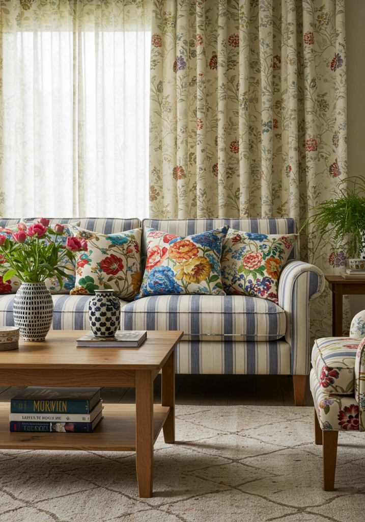
Textile Projects with 70s Colors
Textiles offer low-commitment ways to incorporate 1970s color palette hex:
Dip-Dyed Curtains:
- Start with cream or white cotton curtains
- Create a terracotta or burnt orange dip-dye effect at the bottom
- The gradient effect adds subtle 70s color without overwhelming the space
Macramé Wall Hanging:
- Use natural cotton rope as your base
- Add sections with yarn in harvest gold, avocado green, or burnt orange
- The combination of natural materials and 70s colors creates authentic vintage appeal
Color-Block Throw Pillows:
- Design simple color-blocked patterns combining 2-3 70s colors
- Use textural fabrics like velvet, bouclé, or heavy cotton
- Mix different shapes (round, square, bolster) for varied interest
70s-Inspired Wall Treatments
Create focal points with 70s color palettes on your walls:
Geometric Accent Wall:
- Choose a feature wall in a living space or bedroom
- Design a simple geometric pattern using painter’s tape
- Apply 2-3 colors from a 70s earth tone palette
- The result adds dimension and interest without permanent commitment
Color-Blocked Wall Design:
- Divide a wall into sections using horizontal or vertical lines
- Apply different colors from a cohesive 70s palette to each section
- Keep some sections white or neutral for balance
- This approach creates architectural interest while showcasing 70s colors
Conclusion
The 1970s color palette offers rich inspiration for contemporary design, balancing warmth, character, and connection to nature. From chocolate brown and harvest gold to the iconic avocado green, these distinctive hues create spaces with personality and emotional resonance.
Whether you embrace the full earth tone experience or selectively incorporate 70s-inspired accents, these colors offer a timeless alternative to sterile minimalism. Their continued popularity demonstrates how good design transcends specific eras.
As you consider incorporating elements of 1970s color schemes into your own spaces, remember that the most successful applications balance authenticity with contemporary sensibilities. By understanding both the specific colors and their cultural context, you can create interiors that honor this influential design era while remaining fresh and relevant today.
What 1970s colors resonate most with your design aesthetic? Are you drawn to the earth tones, the vibrant accents, or the distinctive greens? Share your thoughts and your own 70s-inspired design projects in the comments below.